Milwaukee Art Museum, Wisconsin
If this posts seems anachronistic, there’s good reason: it is. Rand and I are on the road for a while, so I’ve been scouring my Flickr stream and the Drafts folder of my blog for old photos and stories I haven’t yet shared with you. This is a post I never got around to finishing from our Milwaukee trip in October, 2012.
The Milwaukee Art Museum is gorgeous. The architecture is so lovely, it’s hard to remember much else about it. I can scarcely recall a single exhibit we saw there. I couldn’t name one piece in the permanent collection. Even the lunch we had at the cafe is hazy in my mind. But the museum stands out in my memory, tall and bright like the building itself.
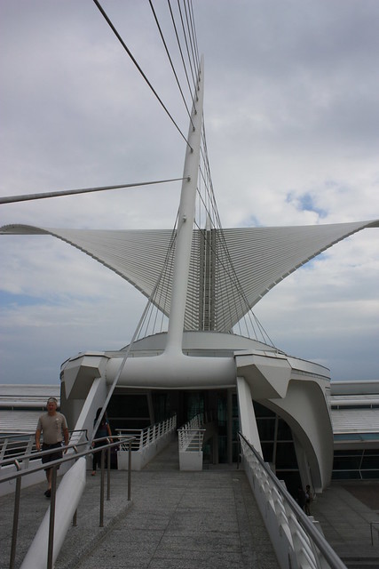
I love my hometown of Seattle dearly, but I can readily admit: our art museum does not hold a candle to this one. It looks vaguely nautical, slightly organic, yet fully modern. Like the skeleton of some exquisite alien.
The Quadracci Pavilion, the newest addition to the MAM, has a raised walkway that connects the building to the downtown core. High above the Pavilion are two massive architectural wings that actually move. They gently expand at 10am, when the museum opens. At noon, they slowly open and close again, like a massive mechanical dove. We timed our visit to coincide perfectly with the midday show.
No one believed me when I told them the wings opened – not until they actually saw it happen.
And at 5pm, as the museum’s doors close, so do its wings.
The interior of the building is no less stunning. The ceiling in the main entryway is more than two stories high, flooding the hall with light.
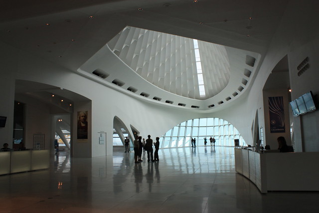
And while I don’t remember any of the works on display, my camera confirms that I did see at least a few of them.
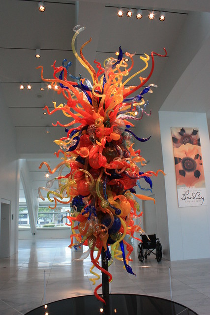
I’m guessing this is a Chihuly because, well, just look at it.
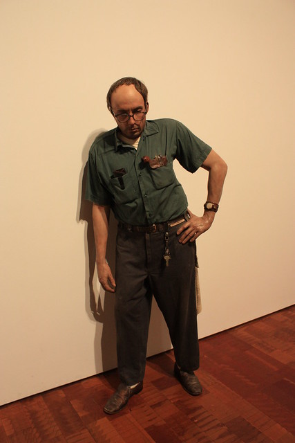
Then there was this statue, which I naturally thought was real when I saw him across the room.
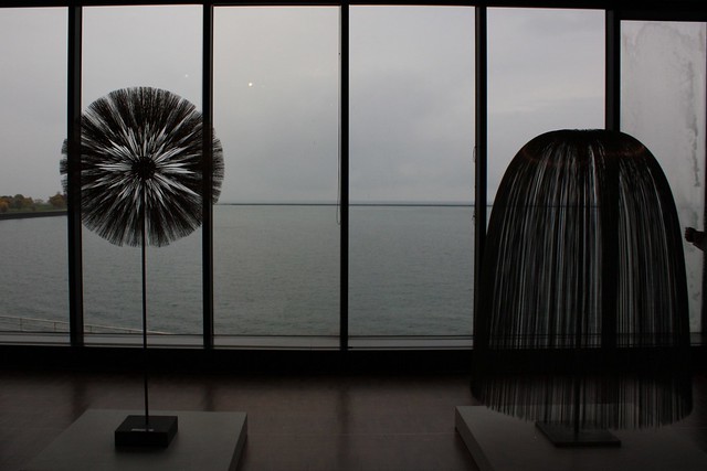
And this lovely piece, which I’ve dubbed “Giant Dandelion and Cousin It Go On A Date.”
But honestly, the building stole the show. I think that perhaps my favorite thing about great architecture is that it sort of has the ability to transport you. You can be in Milwaukee and be reminded of places all over the world.
Like how this hallway in the museum …
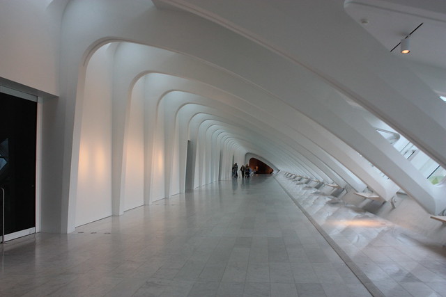
Reminded me of the one we saw in Barcelona at Antoni Gaudí’s Casa Batlló.
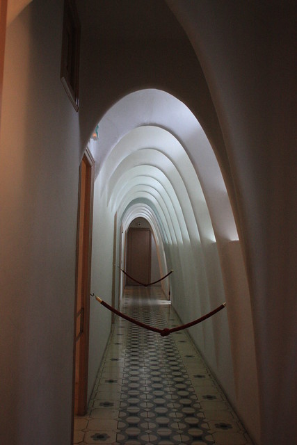
Even more amazing: the hallway above was designed by Gaudí 110 years ago.
Or how the beams and windows on the inside of the Quadracci Pavilion …
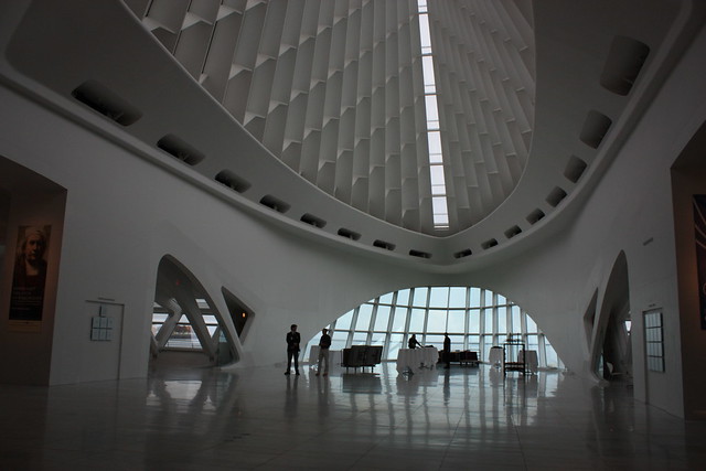
… are not unlike those inside of the Sydney Opera House.
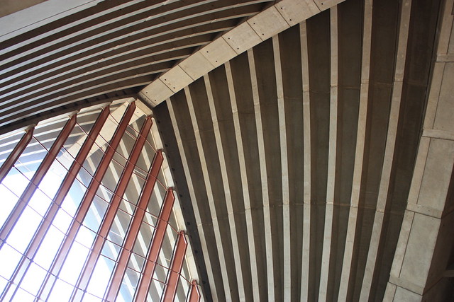
And the way the light filters through them is similar, too …
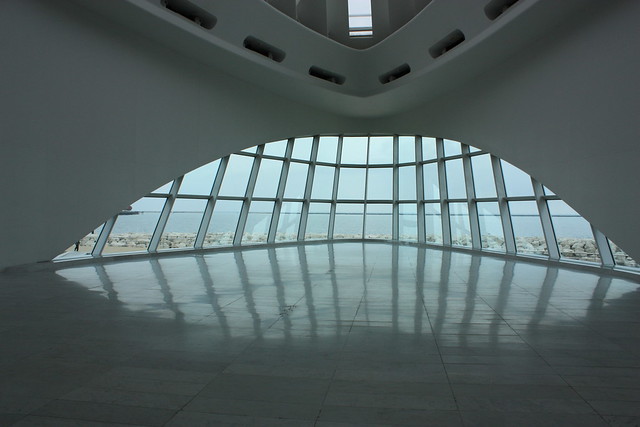
Milwaukee.
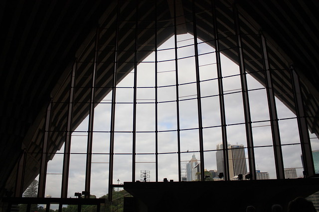
Sydney.
Even the giant, glorious wings outside the Milwaukee Art Museum, unique as though they are, succeeded in hearkening back an earlier trip.
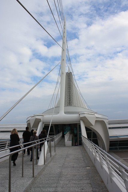
If I stared at them long enough, it was almost as though I was back in Dublin, near the lovely, harp-shaped Saumel Beckett Bridge:
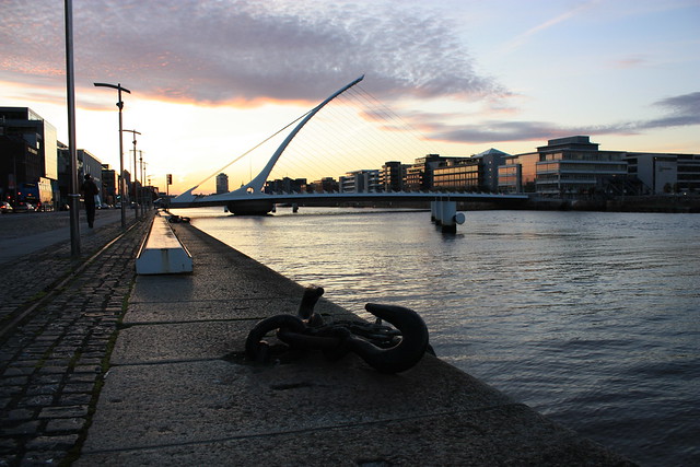
Of course, there’s good reason for this last striking similarity: both the Quadracci Pavilion and the bridge in Dublin were designed by Santiago Calatrava. The Spanish architect has left his signature all over the world.
Perhaps that’s what I loved most about the Milwaukee Art Museum. Not simply that it was beautiful in its own right. But that a visit there was like a trip, in and of itself.
Which, for the price of admission, is a damn good deal.




Leave a Comment